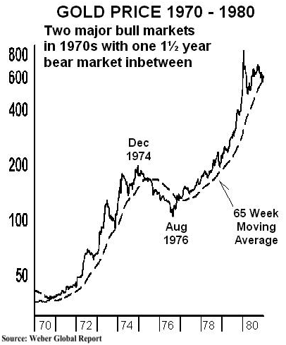
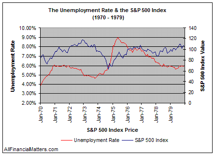
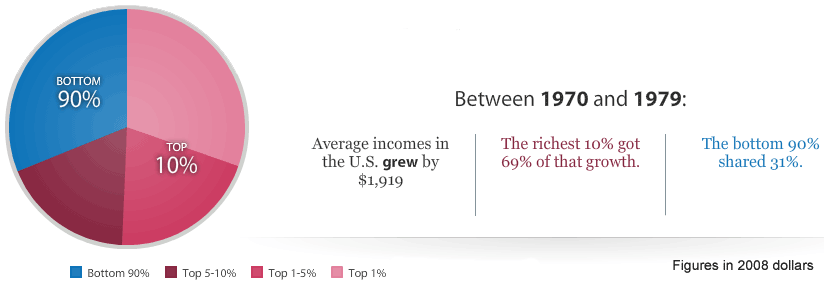
The first graph shows gold prices and the major dip that occurs in 1976. The second graph shows the unemployment rate and how during the 70's raised close to nine percent at one point. The third graph shows the wealth distribution during the seventies; this shows how most of the wealth was retained by the wealthy 10 percent while the other ninety percent of citizens only got thirty one percent of the wealth.